I design digital products that mitigate business risk and brand identities that command attention.
Product Designer & Brand Strategist specializing in transforming complex data into intuitive B2B interfaces and crafting cohesive, scalable design systems.
Based in São Paulo (Cotia/Alphaville) and remote-ready worldwide.
This portfolio is completely responsive, but complex design specs thrive on bigger screens. We recommend viewing on a desktop computer for the full high-fidelity experience.
EBAC Radio: Designing a Mobile E-Learning Audio Platform for Continuous Professional Growth
An end-to-end UX/UI exploration and product design concept aimed at transforming unstructured educational audio content into a seamless, high-retention mobile learning experience for creative professionals.
Role
Lead Product Designer & UX Researcher
SCOPE
Desk Research, Competitive Benchmarking, Persona Mapping, User Stories, Information Architecture, Wireframing, UI Style Guide, High-Fidelity Prototyping, Usability Testing & Iteration
Target Audience
Establish a dedicated mobile-first audio platform to help busy professionals make productive use of dead time (commutes, workouts, and daily chores) through friction-free educational streaming.

Framing the Problem
Modern professionals and students face a constant struggle to balance a busy routine with the necessity of continuous learning. While EBAC possesses an abundance of high-value educational audio content (expert interviews, course highlights, and industry insights), there was no centralized, structured digital channel for organized distribution.
Without a dedicated mobile interface, users could not easily discover, access, or personalize their consumption. My primary challenge was to lead the discovery phase, define a seamless “Golden Path” to engagement, and design a high-fidelity mobile concept that bridges the gap between structured e-learning and modern streaming habits.
The target audience highly values practical, market-oriented content.
Many users actively seek audio content to optimize their time and multitask during everyday routines.
Essential media controls (Play/Pause, Skip/Rewind 15s, and Offline listening) are non-negotiable usability standards for audio players.
Users prefer micro-learning formats (under 5 minutes) rather than mid-length formats (15-20 minutes).
Students prefer a completely independent app interface, separated from their primary EAD course platform.
Users can maintain high focus on dense, technical content during high-distraction environments (like driving or lifting weights).
At what exact moments of the day do users experience the strongest urge or convenience to consume audio learning?
What is the ideal narrative format for educational audio (solo host, structured interview, co-hosted conversation)?
What is the ideal narrative format for educational audio (solo host, structured interview, co-hosted conversation)?
Grounding Design in Market Reality
To validate our suppositions and resolve core doubts, an extensive desk research analyzing published data on podcast and audio consumption behaviors:
Multitasking Habits: Data reveals that 44% of people listen to audio while performing household chores, 24% during commutes, 20% during physical exercise, and 18% during personal care.
Audience Growth: Internet usage statistics indicate that 42.9% of Brazilian users aged 16 to 64 consume podcasts weekly, with Gen Z (15-24) driving an 80% growth wave in educational formats. In fact, 77% of Gen Z listeners state that audio content serves as a crucial supplement to what they don’t learn in formal education.
The “Magic” Duration: Industry analysis shows that the optimal engagement window for educational audio ranges between 35 to 40 minutes, relying heavily on formats such as interviews, deep-dive narratives, and structured audio essays.
Key UX Directives
Optimize for Multitasking: The UI must support one-handed, low-attention interactions since users are actively doing other tasks while listening.
Build for Flex-Time: Design structural tools like auto-saved progress, content chaptering, and multi-device synchronization so users can pause on their phone during a commute and resume instantly on a tablet or desktop without friction.
Competitive Benchmarking: Merging Two Worlds
To establish high-performance usability patterns, we drafted a competitive benchmark analysis comparing Spotify, Audible, and Udemy against our requirements:
Spotify (The Usability Benchmark)
While it sets the standard for audio streaming with flexible playback speeds (0.5x to 3.5x), offline downloads, and custom playlists, it completely lacks educational utility—offering zero support for synchronized text transcripts or downloadable study links.
Audible (The Narrative Standard)
Highly optimized for long-form audio consumption and offline listening, but falls short on educational depth. Its transcripts are limited to basic AI-generated text, with no integration for external resources, course modules, or curriculum structure.
Udemy (The E-Learning Standard)
Built strictly for education, providing robust video transcripts and downloadable study assets. However, it relies entirely on video, missing the background-playback ergonomics, custom playlists, and audio-first flexibility required for learning on the move.
The EBAC Radio Opportunity
Our concept lives exactly at the intersection of streaming ergonomics and structured learning. We merged Spotify’s zero-friction audio player (one-tap offline downloads, adjustable playback speed, and custom playlists) with Udemy’s educational rigor (interactive text transcripts and direct resource links) to create the ultimate audio-learning experience.
Feature / Criteria
EBAC Radio
Spotify
Audible
Udemy
Primary Content
Short-form educational audio & interviews
Music, podcasts, and audiobooks
Audiobooks & spoken text
Structured video-led courses
Speed Controls
Yes (Priority)
Yes (0.5x to 3.5x)
Yes (0.5x to 3x)
Yes (0.5x to 3x)
Offline Downloads
Yes (Priority)
Yes
Yes
Yes
Transcripts
Yes (High Opportunity)
Music lyrics only
AI auto-transcripts only
Yes (Structured text)
Supplementary Docs
Yes (Actionable value)
No
No
Yes (E-learning standard)
Playlists / Tracks
Custom learning tracks
Yes
Playlist sorting
No (Fixed syllabus order)
The Opportunity
E-learning platforms often lack the slick, frictionless playback usability of streaming giants, while mainstream audio apps lack the educational depth and structured study support of LMS platforms. EBAC Radio sits at the intersection of both: Furthermore, it merges Spotify’s playback ease with Udemy’s educational depth.
Core User Archetypes
Based on our market research, we arrived at our plausible audience into three behavioral proto-personas to guide our feature prioritization and User Stories:
The Optimizer
Juliana
25, Junior Graphic Designer
Context: Commutes 2 hours daily on public transit. Feels this time is entirely lost.
Core Pain Point: Poor mobile connection on the move and limited cellular data.
Design Solution: One-tap offline downloading on the Home and Playlist screens to ensure uninterrupted learning without burning data.
The Analyst
Carlos
38, Senior Product Manager
Context: Highly analytical, metódical, and values dense, top-tier industry insights.
Core Pain Point: Time-poverty. Needs to absorb high-quality concepts quickly during early morning runs.
Design Solution: Prominent playback speed controls (1.5x/2.0x) and interactive on-screen transcriptions to easily scan and verify key definitions without stopping his run.
The Explorer
Patricia
31, Copywriter
Context: Feels overwhelmed by the massive amount of unstructured design advice online. Needs direction.
Core Pain Point: Analysis paralysis. Doesn’t know what to listen to first to build a structured study habit.
Design Solution: Presets like curated “Career Tracks” (playlists organized by theme/level) and smart filters based on duration to fit learning into quick coffee breaks.
The Optimizer
The Optimizer
Juliana
25, Junior Graphic Designer
Context: Commutes 2 hours daily on public transit. Feels this time is entirely lost.
Core Pain Point: Poor mobile connection on the move and limited cellular data.
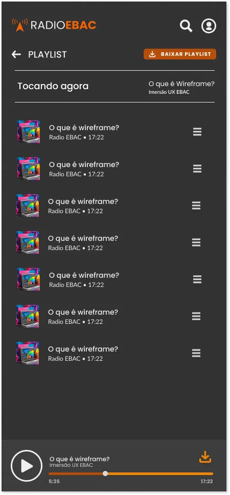
Design Solution: One-tap offline downloading on the Home and Playlist screens to ensure uninterrupted learning without burning data.
The Analyst
The Analyst
Carlos
38, Senior Product Manager
Context: Highly analytical, metódical, and values dense, top-tier industry insights.
Core Pain Point: Time-poverty. Needs to absorb high-quality concepts quickly during early morning runs.
Design Solution: Prominent playback speed controls (1.5x/2.0x) and interactive on-screen transcriptions to easily scan and verify key definitions without stopping his run.
The Explorer
The Explorer
Patricia
31, Copywriter
Context: Feels overwhelmed by the massive amount of unstructured design advice online. Needs direction.
Core Pain Point: Analysis paralysis. Doesn’t know what to listen to first to build a structured study habit.
Design Solution: Presets like curated “Career Tracks” (playlists organized by theme/level) and smart filters based on duration to fit learning into quick coffee breaks.
Information Architecture & Golden Path
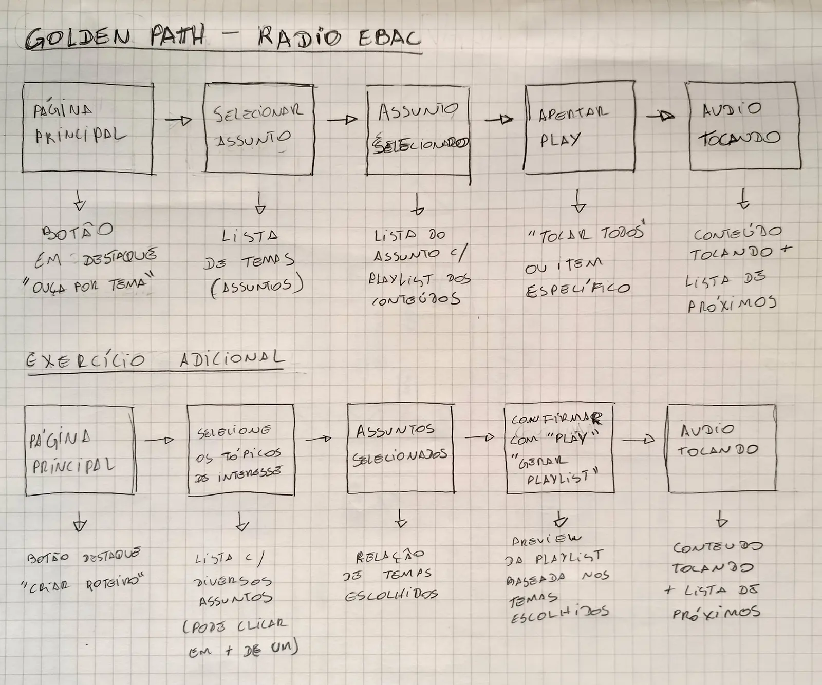
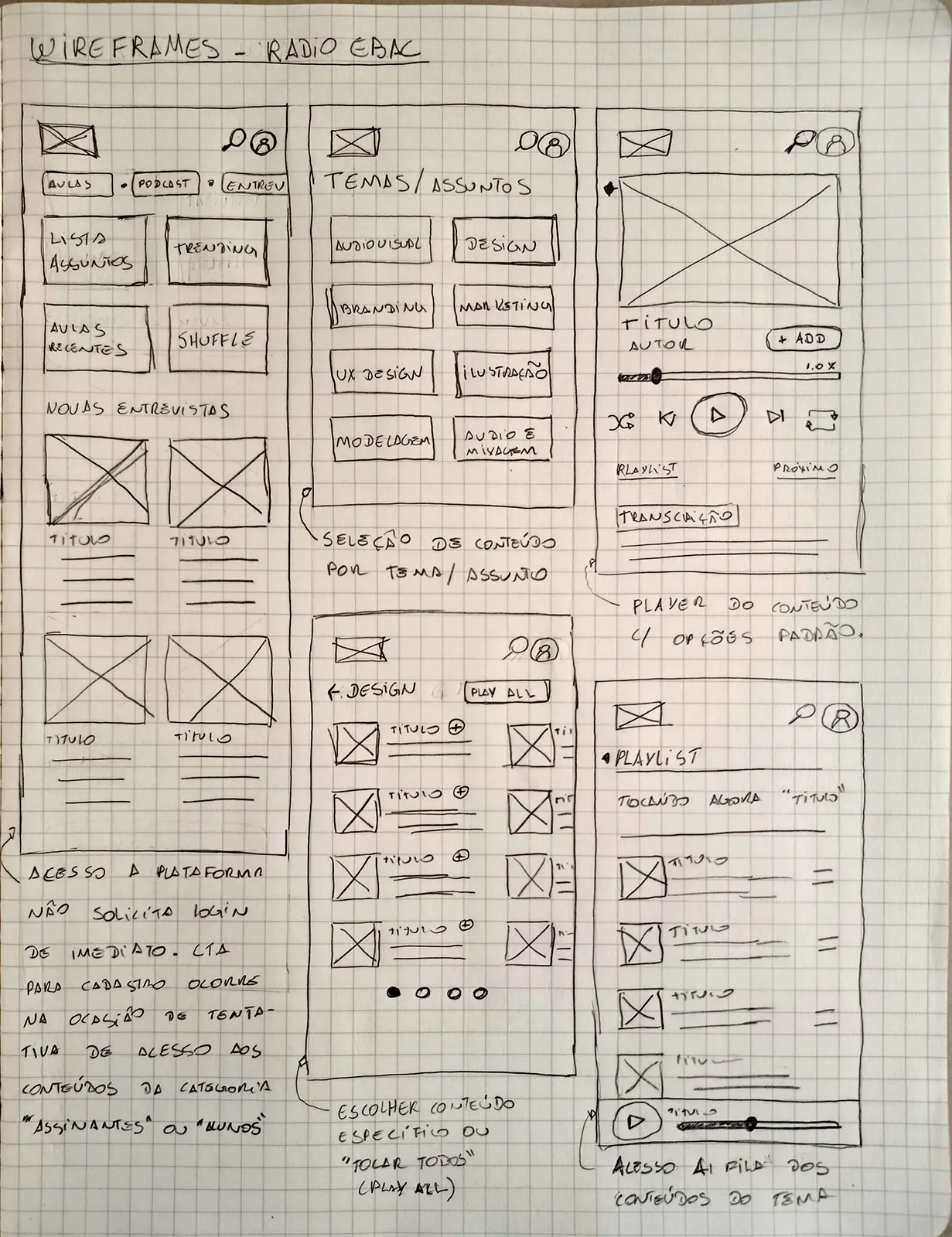
Before diving into high-fidelity UI, a series of physical paper wireframes to map the optimal “Golden Path”, were sketched. The goal was to take the user from App Launch to playing a highly relevant, curated educational audio file in under 4 taps.
1
Discover
Lands on the Home Screen and is greeted by a prominent "Listen by Topic" or "Career Playlist" card.
2
Select
Choose on a specific topic (e.g., UX Design), leading to a curated playlist of episodes.
3
Trigger
Taps "Play All" or a specific episode card.
4
Learn
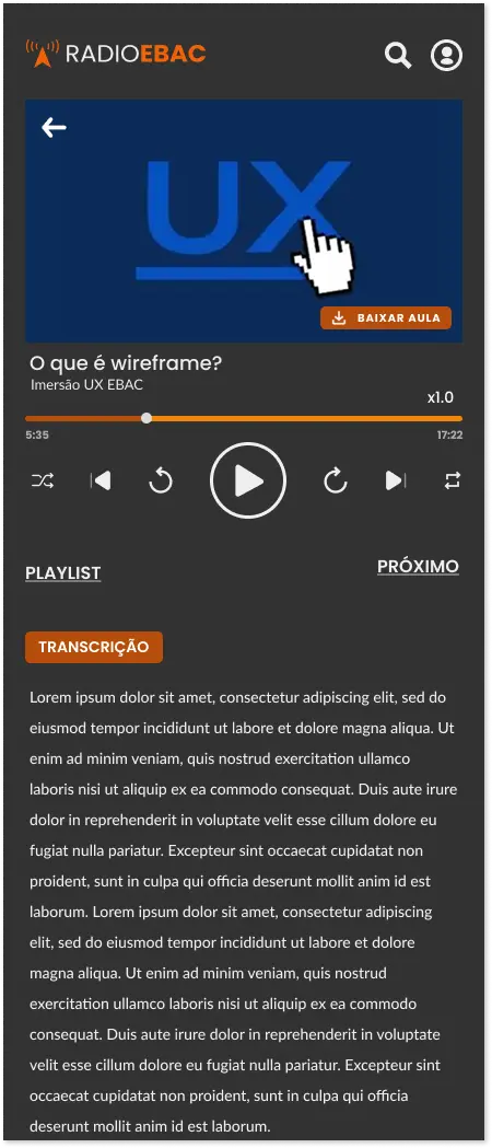
The dedicated Player opens, initiating playback while displaying speed controls, supplementary materials, and an interactive transcript immediately below.
High-Fidelity Wireframes: Skeletons & Layout Hierarchy
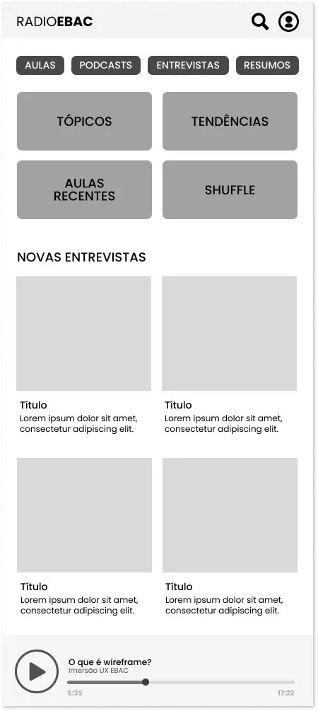
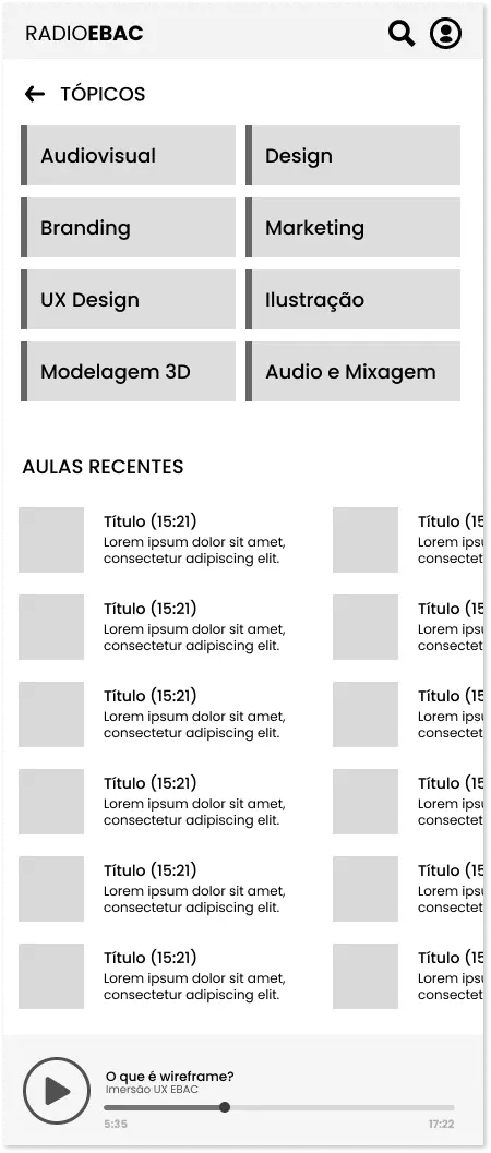
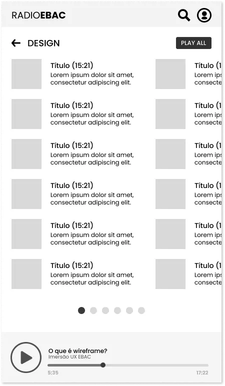
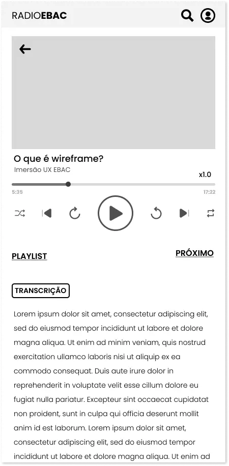
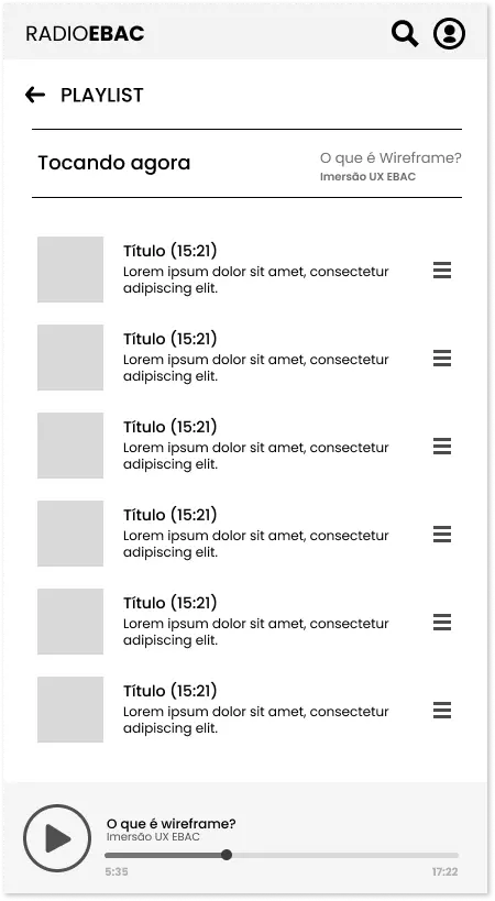
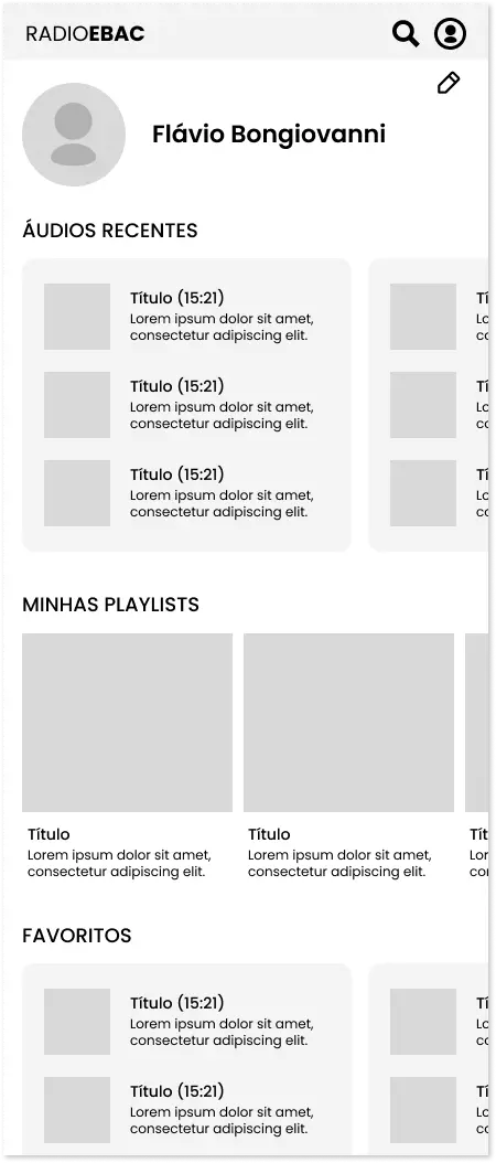
Once the paper sketches were validated, they were translated into high-fidelity grayscale wireframes in Figma. This critical transitional phase isolated interface usability, information density, and functional prioritization from the emotional influence of colors, fonts, or decorative assets.
By restricting the design entirely to black-and-white lines, basic structural containers, and clean layout grids, I focused on three engineering priorities:
Visual Zoning and Spacing
Establishing clear, consistent bounding boxes for category cards, play controls, and typography scales to ensure high-priority interactive components (like the “Play” and “Download” buttons) received immediate visual focus.
Single-Screen Content Integration
Modeling the layout of the dedicated media player to ensure that the dense elements (waveform bar, speed controls, and interactive transcripts) fit cleanly onto standard mobile displays without causing visual noise or excessive scrolling.
Familiar Interactive Anchors
By using universal layout patterns (top navigation headers, card carousels, and a standard bottom player bar), We designed an interface that feels instantly familiar, enabling users to navigate with zero learning curve while walking or multitasking.
Once the paper sketches were validated, they were translated into high-fidelity grayscale wireframes in Figma. This critical transitional phase isolated interface usability, information density, and functional prioritization from the emotional influence of colors, fonts, or decorative assets.
By restricting the design entirely to black-and-white lines, basic structural containers, and clean layout grids, we focus on three engineering priorities:
Visual Zoning and Spacing: Establishing clear, consistent bounding boxes for category cards, play controls, and typography scales to ensure high-priority interactive components (like the “Play” and “Download” buttons) received immediate visual focus.
Single-Screen Content Integration: Modeling the layout of the dedicated media player to ensure that the dense elements (waveform bar, speed controls, and interactive transcripts) fit cleanly onto standard mobile displays without causing visual noise or excessive scrolling.
Familiar Interactive Anchors: By using universal layout patterns (top navigation headers, card carousels, and a standard bottom player bar), we designed an interface that feels instantly familiar, enabling users to navigate with zero learning curve while walking or multitasking.
Style Guide & Design Tokens
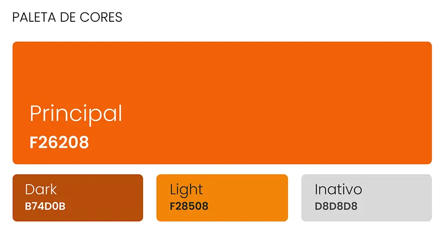
A comprehensive, developer-ready Style Guide to ensure complete visual consistency, lower cognitive load, and reflect EBAC’s premium brand:

#F26208
#F28508
#B74D0B
Chromatic Strategy
Brand Primary: Vibrant Orange (#F26208) and Dark Amber (#B74D0B) used selectively for main actions, active states, and focus elements.
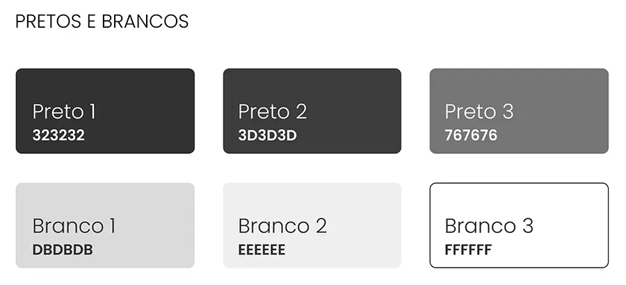
Stark Neutrals: A range of rich grays (#323232 to #767676) paired with clean whites (#FFFFFF to #EEEEEE) to build a dark-mode theme that reduces screen glare during late-night study sessions.
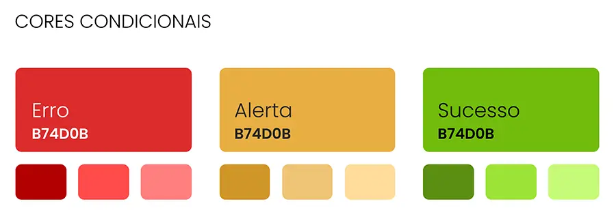
Status Semantics: Accessible tones for Error, Alert, and Success states to provide immediate visual feedback.
Aa
Lato
Aa
Poppins
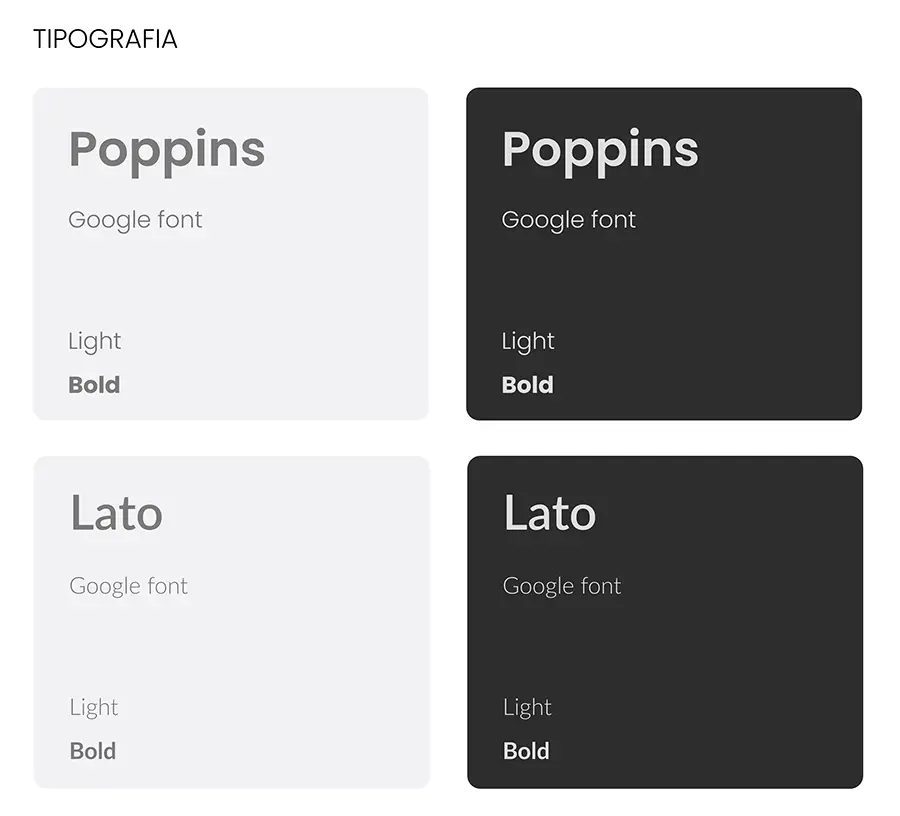
The Typography Duo
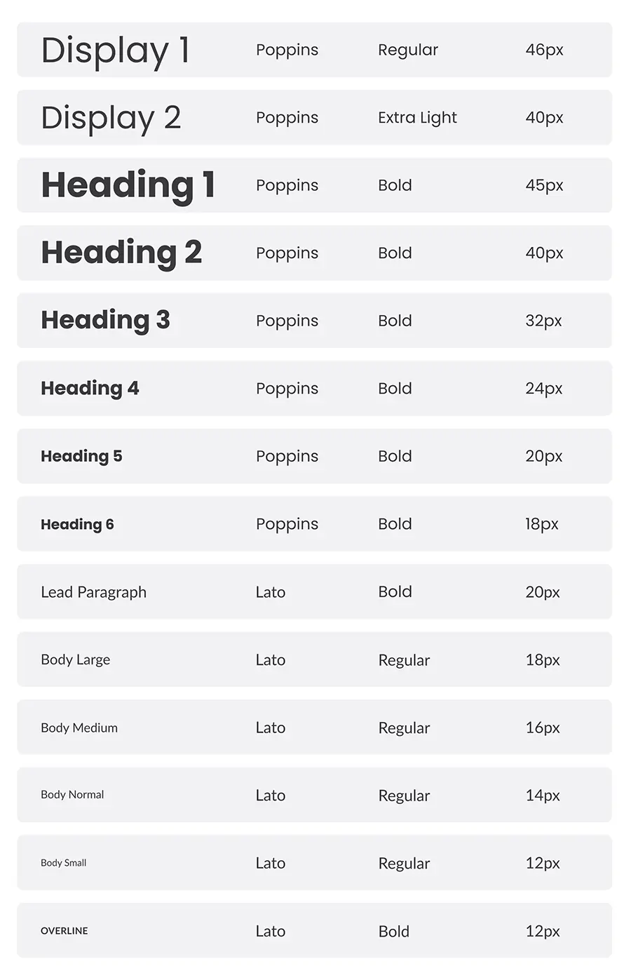
Poppins (Google Font): Implemented for bold, modern headings and display titles (up to 46px) to convey structure and visual hierarchy.
Lato (Google Font): Used for body text, data lists, and transcripts due to its exceptional readability and neutral geometric footprint on small mobile displays.
High-Fidelity Prototype
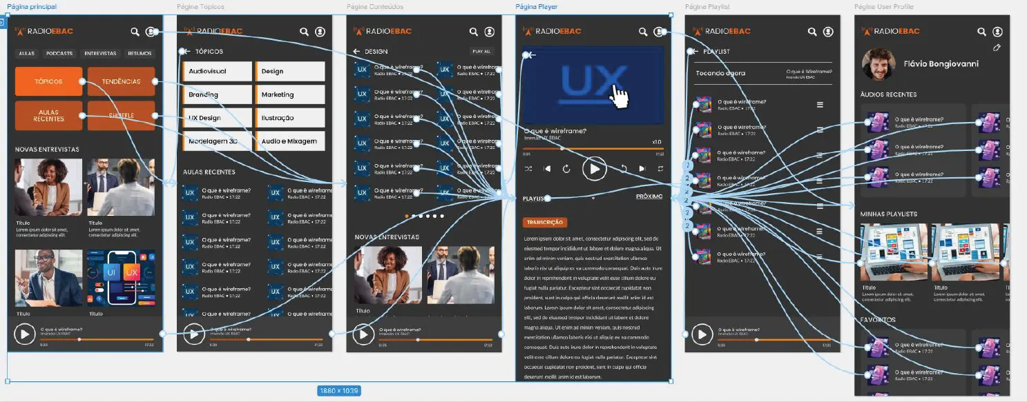
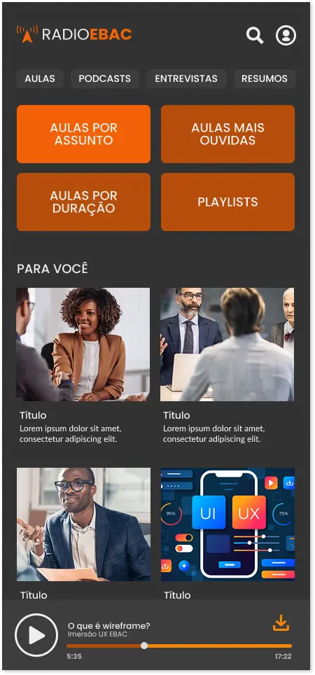
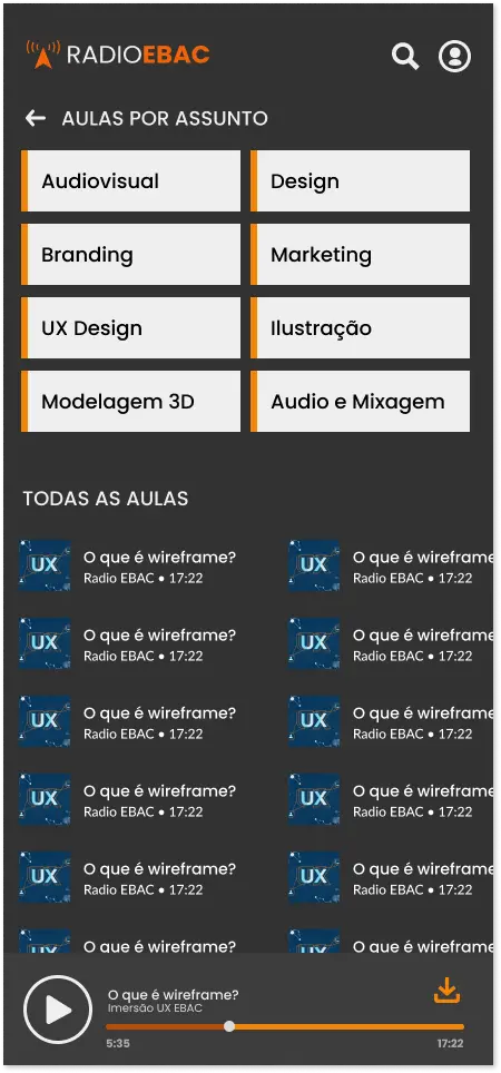
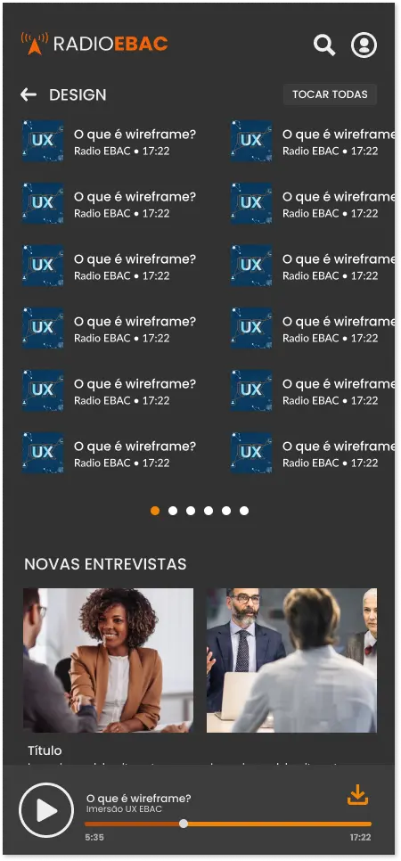
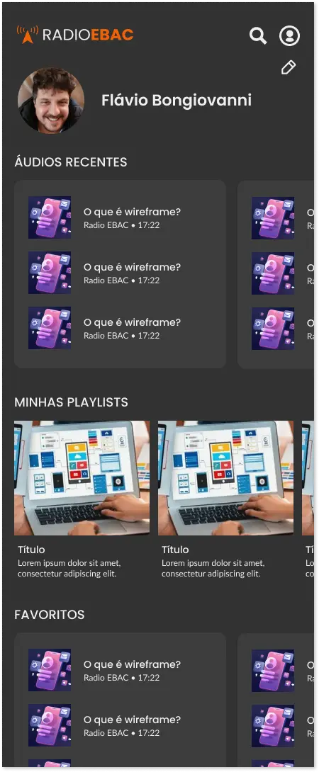
Using our component-driven Figma library, and translating the verified wireframes into an interactive, high-fidelity mobile prototype. The interface features a sleek dark-mode aesthetic with clean card grids, semantic category tags, and an immersive media player where all primary actions (play, skip, speed, download, and transcript) are grouped within easy thumb-reach for one-handed multitasking.
Usability Testing & Iteration
To validate our design decisions, we needed a moderated usability testing sessions with 6 participants reflecting our target personas, yielding a 60% task success and satisfaction rate. The sessions revealed critical strengths and clear optimization opportunities:
Key Strengths (To Keep)
Frictionless Playback: Once the user successfully entered the player, the consumption loop was praised as intuitive, fast, and remarkably familiar.
Navigation Comfort: Users appreciated the logical back-routing structure from the player to the category playlists.
Friction 1: Vague Terminology (Microcopy)
Several testers hesitated when facing generic category labels like “Topics” or specific thumbnail actions.
- Redesign Action: Rewrote microcopy across the app, changing generic navigation titles like “Topics” to highly descriptive actions such as “Aulas por Assunto” (Classes by Subject).
Friction 2: Ambiguous Navigation Hierarchy
Some users felt slightly disoriented in the deeper levels of the content tree and struggled to find an instant way back to the home screen.
- Redesign Action: Implemented a global sticky navigation header where tapping the main “EBAC Radio” logo instantly acts as a global “Home” button, providing an emergency escape hatch.
Friction 3: Feature Expansion Request
Testers noted they wanted to mark or bookmark exact timestamps in an audio class to refer back to a technical definition later.
- Redesign Action: Added a future roadmap initiative to implement a “Time-Marker Bookmark” tool within the interactive transcript UI.
To validate our design decisions, we needed a moderated usability testing sessions with 6 participants reflecting our target personas, yielding a 60% task success and satisfaction rate. The sessions revealed critical strengths and clear optimization opportunities:
Key Strengths (To Keep):
Frictionless Playback: Once the user successfully entered the player, the consumption loop was praised as intuitive, fast, and remarkably familiar.
Navigation Comfort: Users appreciated the logical back-routing structure from the player to the category playlists.
Friction Points & Actionable Redesigns (Immediate Iterations):
Friction 1: Vague Terminology (Microcopy): Several testers hesitated when facing generic category labels like “Topics” or specific thumbnail actions.
Redesign Action: Rewrote microcopy across the app, changing generic navigation titles like “Topics” to highly descriptive actions such as “Aulas por Assunto” (Classes by Subject).
Friction 2: Ambiguous Navigation Hierarchy: Some users felt slightly disoriented in the deeper levels of the content tree and struggled to find an instant way back to the home screen.
Redesign Action: Implemented a global sticky navigation header where tapping the main “EBAC Radio” logo instantly acts as a global “Home” button, providing an emergency escape hatch.
Friction 3: Feature Expansion Request: Testers noted they wanted to mark or bookmark exact timestamps in an audio class to refer back to a technical definition later.
Redesign Action: Added a future roadmap initiative to implement a “Time-Marker Bookmark” tool within the interactive transcript UI.
"By treating a student exercise with the operational rigor of an enterprise product launch, EBAC Radio proves that high-value education doesn't need to be tied to a desktop. True mobile learning is unlocked when we combine the effortless, empathetic UX of consumer media with the structured depth of a curriculum."
Devagar Paraty: Elevating a Solar Identity Through Bauhaus Principles and Mathematical Harmony
Polishing an authentic brand essence to optimize digital performance, scalable assets, and visual consistency for a premium hospitality experience.
Role
Lead Brand & Product Designer
SCOPE
Logo Refinement, Typography System, Color Strategy, Responsive Social Media Brand System
Core Methodology
Bauhaus Functionalism & Golden Ratio Proportions

Polishing the Soul: Geometric Precision Meets Organic Comfort
The original Devagar Paraty logo captured the perfect local metaphor: the sun setting over the calm ocean. However, it lacked the geometric precision needed for modern high-performance digital displays.
Using the Golden Ratio as a mathematical anchor, I disassembled the symbol’s vectors. Softened the edges to make them organic and inviting (Bauhaus-inspired), and increased the negative space between the color blocks.
This guarantees the logo “breathes” beautifully and remains perfectly legible, whether as a tiny Instagram avatar or scaled on a large print poster.


Golden Ratio Precision
Every curve and proportion in the logo follows the mathematical harmony of the golden ratio (φ ≈ 1.618), creating a naturally balanced and aesthetically pleasing composition.
• Organic wave curvature based on Fibonacci spirals
• Optimized negative space for digital legibility
• Scalable from 16px to billboard size


Refining the Primary Tones: Chromatic Accessibility & Luminosity
During the audit phase, we identified a critical operational bottleneck: the original color values representing the land and the sea carried an excessively heavy, dark chromatic load. While contrast looked acceptable on paper, it caused significant detail-blurring and low legibility across modern digital platforms and mobile devices.
As a result, we executed two strategic design adjustments:

Dynamic Luminosity & Saturation
We recalibrated the hue, brightness, and saturation values to mimic the authentic, organic light of a Paraty sunset. By shifting away from dense, muddy tones, the new palette brings an airy, solar warmth that immediately connects with the user’s emotions while optimizing screen performance.

Visual Aeration & Shape Integrity
The brightening of the colors works hand-in-hand with the increase in physical negative space between the segmented solids. This calculated separation prevents individual color slices from merging visually when scaled down to small mobile avatars or system icons, allowing each shape to maintain its structural value and clean geometry.
The "Curtain System": Scalable Content Engine for Social Media
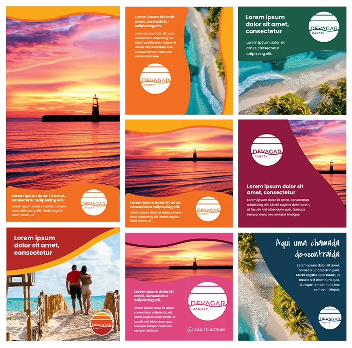
A brand today lives in motion. To help the client manage content without design bottlenecks. Specifically, we extracted the “Main Solid” — a fluid shape derived directly from the logo’s wave curvature.
This solid acts as a responsive “Curtain” or visual overlay. Positioned at any angle, it serves as a solid color background that isolates text from high-contrast lifestyle photography.
Supported by a clean, modern type hierarchy (Montserrat & Poppins) and authentic handwritten accents (Homemade Apple), this system allows the team to generate professional, on-brand social media assets in minutes.


The Solar Color Palette
FBAA19
Golden Hour
F36E21
Dusk Orange
EF4623
Sunset Flare
B62925
Twilight Red
911940
Deep Horizon
Secondary Palettes


"Rebranding isn't about replacing the old; it's about polishing its structure so the brand can communicate with authority and scale effortlessly across a living digital ecosystem."
André Barcinski: Crafting a Bold, Uncompromising Brand for Cultural Criticism
A personal brand identity that fuses Saul Bass's narrative synthesis with Russian Constructivist power to build a unified media ecosystem.
Role
Lead Brand & Digital Product Designer
SCOPE
Saul Bass Graphic Synthesis & Russian Constructivism Geometry
Core Methodology
Industrial-scale content generation with high-impact visuals

Visual Authority for an Uncompromising Voice
Following the successful relaunch of his website, prominent cultural critic André Barcinski needed a visual voice as strong as his written content. The goal was to unify his channels (YouTube, articles, newsletters) into an instantly recognizable, authoritative personal brand.
Merging two heavy-hitting design philosophies:
Constructivist Urgency
Red and black geometry that demands attention and conveys structural critique. Bold, angular, and unapologetically direct.
Saul Bass Narrative Synthesis
Reducing complex forms to their absolute visual essence. Every element stripped down to pure communicative power.
Base - Intersection Construtivism and Saul Bass

D2431B
Manifesto Red
The primary voice. Urgent, bold, demanding attention.
000000
Ink Absolute
The foundation. Serious, uncompromising, absolute.
FFFFFF
Canvas White
The contrast. Clean, direct, no ambiguity.
The Essential Portrait Meets Handcrafted Efficiency
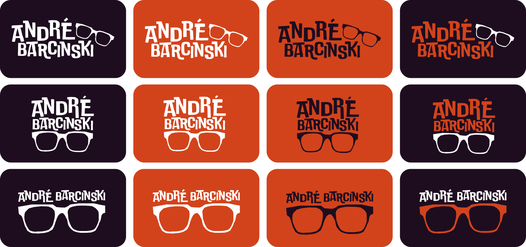
The main icon is a masterclass in reduction. Using a black-and-white photograph of André, using vector tools to trace and isolate his most recognizable feature: his heavy, angled eyeglasses. The glasses become a conceptual “lens” through which cinema, music, and society are analyzed.
To make the brand highly operational, we integrated the “Double Bass” typeface, which perfectly mimics the handmade, irregular look of vintage film posters.
While custom-drawing every single letter would be too slow and costly for a daily content creator, however utilizing a curated digital typeface with a handmade feel allowed the production team to instantly generate cohesive title cards, social media assets, and overlays without losing the brand’s raw artistic edge.


1. Photography
High-contrast black & white portrait capturing distinctive features

2. Vectorization
Isolating iconic eyeglasses through precision vector tracing

3. Brand Icon
Final symbol: The critical lens in pure, scalable form
Scalable Production System
The brand system includes pre-designed templates for:
- YouTube thumbnail templates with bold typography
- Newsletter headers with constructivist geometry
- Social media cards with the iconic lens symbol
- Article title overlays with vintage poster aesthetics


"Good art direction is a balance of aesthetic courage and production logic. For André Barcinski, the identity is not just a mark — it is a high-speed engine designed to make a critical voice visually undeniable."


Form serves function. Identity commands trust. I bridge the gap.
My Approach as a Product Designer
Modern digital design has fallen into a trap of superficial templates. Beautiful interfaces are built over broken operational processes; stunning logos are launched without scalable design systems to support them. Therefore, I believe true design lives at the intersection of mathematical precision and aesthetic courage.
My work is anchored in three core convictions:
1. Business-Driven UX
A B2B interface should not just look clean; it must mitigate financial leakage, reduce cognitive fatigue, and translate complex data inputs into actionable paths (like automating exception resolution in under 5 clicks).
2. Mathematically Sound Branding
Great visual identities are built, not decorated. Utilizing structural frameworks like Bauhaus and the Golden Ratio ensures a brand communicates with authority and scales effortlessly across any digital device.
3. Culturally Rich Art Direction
Meaning drives retention. By studying the pioneers of visual narrative, I build identity ecosystems with historical weight, conceptual depth, and extreme execution logic.
About Me
Flávio Bongiovanni is a Senior Product Designer with a 25-year track record of navigating complex digital landscapes. Holding a formal degree in Digital Design, he specializes in combining high-complexity UX/UI product development with high-impact branding. Ultimately, his content-first, business-oriented approach ensures that every system is friction-free, driving both revenue growth and operational efficiency.
Let's build something substantial together.
Whether you are looking for an English-speaking Product Designer for remote positions worldwide, or a premium consultant to transform your digital identity in Alphaville, Barueri, São Paulo, and the Raposo Tavares corridor — let’s connect.
Location
São Paulo (Cotia / Alphaville Area)
Available worldwide for remote positions as a Senior Product Designer. Hybrid Roles (under 40-min commute)
© 2026 Flávio Bongiovanni. All rights reserved.
Product Designer & Brand Strategist